
Lord & Taylor
Interactive Watch Guide
Role:
Art Director, Interaction Designer, UX/UI Designer
Tools:
Photoshop
Sketch
InVision

About:
Lord & Taylor is the oldest American department store and an iconic brand of classic luxury. It continues its legacy through e-commerce.
Lord & Taylor
Interactive Watch Guide
An interactive experience that filters fitness watches based on functionality and buyer preferences

The Challenge:
Customers were overwhelmed by too many options and needed a way to narrow their search
The Lord & Taylor merchandising team wanted to boost online sales for their watches and fitness tracker inventory. There was a constant surplus and according to data, users became overwhelmed and lost interest before ever adding items to their shopping carts. They needed an easier way to see all the products and compare them.
The Ask:
Design a graph chart users could download that lists the watches and all their functionalities
The initial request was to design a chart PDF of the watches to imbed on the site. Buyers could download and then use as a guide to make their selection for purchase.

Checklist example for the design suggested by stakeholders
The goal was to make it easier for users to compare and choose which item was best for them without having to navigate between multiple product detail pages and descriptions.
The Solution:
An interactive comparison tool that buyers could use to customize their selection preferences, filter inventory and easily find their perfect watch for purchase
After reviewing all of the inventory in the array, I started to think about how to find a watch perfect for a buyer’s needs and did some brainstorming to figure out how to break apart the information and organize what that could look like visually working with some constraints.

Constraints to work within for the design
I mapped out a potential flow for the watch shopper:

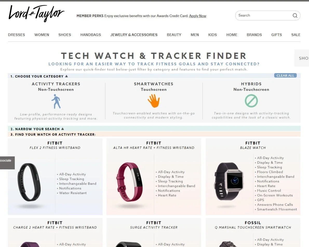
I collaborated with the front-end development team to design and create a digital interactive page within the site that consumers could view all of the inventory and then narrow results.

Low fidelity sketches I presented to the engineering team
We needed to display the functionality options of all the watches without pushing the product “below the fold.” I solved the problem by creating a collapsing filter menu.
Users could narrow their search by clicking the options they prefer and the products would populate below the menu based on the filters.

After narrowing their search, buyers could click on the items to see the product detail page for more details and directly add choices to their shopping cart.
Watch The MVP:
Future Iteration:
Move the lists of functionalities from within the image containers into hover modal popups
The marketing team required the functionalities to be listed with their images. I felt we should explore some alternatives that would meet ADA compliance and allow the images to really shine. My suggestion was a hover modal that would popup for users once they scrolled over the corresponding watch that listed all the functions. While the marketing and merchandising team liked this idea, there was no bandwidth from the engineering team to execute at the time of product launch and was added to the backlog for possible future iterations.
