
Haverdash
New Member Flow Addition
Role:
Product Designer
Tools:
Photoshop
Sketch
InVision

About:
Haverdash is a clothing rental subscription service. Users do not choose specific items for each box. Instead, items are selected randomly based on availability from within the array of products users have in their virtual “closets.”
Haverdash
New Member Flow Addition
A 3-step addition to the member sign-up flow to entice users to add items into virtual “closets”

The Challenge:
Once users signed up for the service, they were not filling up their virtual closets
Based on data, users didn’t realize they needed to fill their closets after the initial sign-up. They were only adding a few items, if any. This was problematic because the inventory of clothing is constantly shifting in the distribution centers, therefore members did not have enough of an array of available items in their closets to fill the first box.
The previous sign-up flow:

The ask:
Design additional steps to the flow that motivates new users to add more items to their closets
The first version of design was based on requests from company stakeholders to show some sort of meter as a way to visually represent users putting up to 16 items in their closets and the more items the better. (“12 items is better, but 16 items is best,” etc.)
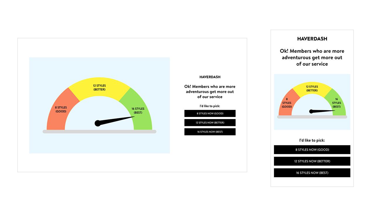
But there were some weaknesses with the design:
The design team felt that the visual idea and copywriting was disconnected from the look and feel of the existing user journey and felt it was misaligned with the overarching branding and style of Haverdash.
We also realized there was no need for three buttons on the first step, as all the CTA options took members to the same place: their closet.
We needed a better way to visually let members know they should add more items for a better experience with our service.
The Solution:
A 3-step addition within the new user flow that is cohesive with the branding style and includes a clothing tracker to entice members to keep adding items to their closets
I worked with a copywriter and brand manager to provide design options for the 3-step solution that aligned the user interface with our brand guidelines.
We brainstormed and invisioned the flow to have three extra steps:
An introduction page, welcoming new members

2. A sticky navigation at the bottom of the page that tracks items being added
As members add more clothing to their closets, the tracker shows their item status
3. A confirmation modal that lets members know their first box is on its way
We also wanted to focus on the voice and tone to strengthen the added flow and be cohesive with the rest of the brand’s product experience.
The final product was more aligned with the Haverdash brand our members are familiar with and the additional steps in the flow helped to alleviate the lag of members waiting for their first boxes, boosting customer loyalty and satisfaction.

The MVP:
![Welcome 1v1 Payoff [Layout D].jpg](https://images.squarespace-cdn.com/content/v1/6006006f2f57da1e2e738cde/1611605095035-96HGH1P8F0UBBYBKQ28B/Welcome+1v1+Payoff+%5BLayout+D%5D.jpg)


